Video: Eye On Design, Tillinger Shirts

As the Presidents Cup arrives in the greater New York City region, it seems like a fine time to shift the Eye On Design focus from golf architecture to a Manhattan golf-focused clothing company in the making.

If you're an entrepreneur looking for a little inspiration, check out Jordan Sack's story in this nice feature by The Unconventionalist.

I stumbled on Sack's Instagram page thanks to a recommendation by the social media platform, and soon learned the "Till" portion of the name was inspired by his appreciation for golf architecxt A.W. Tillinghast. Since then I've enjoyed his "stories" and images from New York City detailing the creation of the Tillinger shirt brand.

Now in the third batch of golf shirts combining moisture-wicking fabric with excellent fit, these Made in the USA shirts sport enough flair to make the shirts wearable off the course, too. Sack's is the youngest of several companies devoted to making clothes designed for the golf swing and a lifestyle that includes wearing collared shirts (untucked) off the course.

You can check out Sack's website here, and specifically, the Gotham, Charlie2 and Maverick shirts from his latest batch. Tillinger shirts retail for $68 (shipping and golf tees included).

On the fit side, I'm 6/2 195 and have purchased a Large in the Maverick and Charlie and love them. My Eye On Design review:

Eye on Design Video: LACC's Par-3/Par-4 7th Hole

Architect George Thomas's effort to propel the Golden Age forward with more intricate course strategy will be on display this week at the Walker Cup. With one day to go before the opening ceremony, both teams are getting a sense of the possible hole location and tee scenarios making LACC North such a fascinating study. (In my view, the second best match play course on the planet.)

On no hole will that be more evident than the par-3 7th, which also can morph into a fascinating risk-reward par-4 using a more strategically demanding hole location. I explain here...

Video: Eye On Design, LACC's Little 17th

It won't be used in the Walker Cup matches but you'll see if sitting next to the big 17th hole.

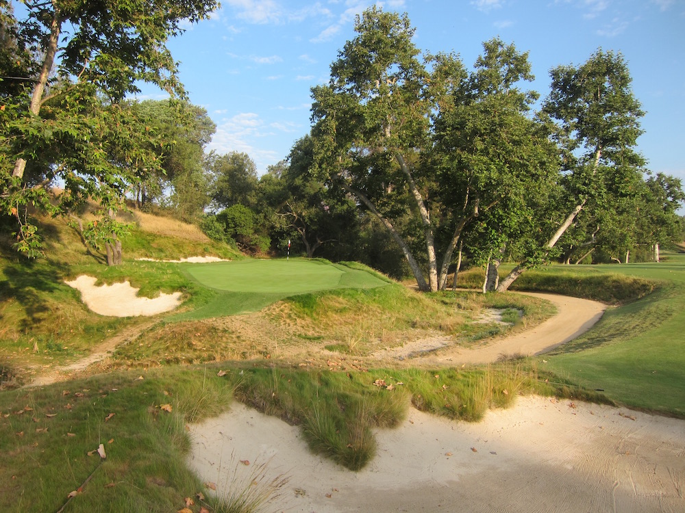
We restored this little beauty of a greensite that caused George Thomas headaches after a course setup gone awry in the 1925 California State Open.

In this Eye On Design, I explain what the history of this hole is all about...

Video: Eye On Design, The Walker Cup Explained

The 2017 Walker Cup is here and Los Angeles is sensing the buzz! The motorcades have stifled traffic and the paparazzi have staked out the team hotel and...ok that's a stretch. But as we discussed on Morning Drive today, this is one we Angelenos have been anticipating for some time.

But while the teams enjoy some sightseeing golf, as Ryan Lavner noted for GolfChannel.com, this site is going to be all in on this event. So my apologies in advance for those still hurting from the lack of Solheim Cup coverage during U.S. Amateur week, but this is just the third Walker Cup to visit the west coast, the first in Southern California and Los Angeles Country Club's first national television appearance. (Clubhouse and pub sign on right depicted by Lee Wybranski.)

Full and only disclosure here for the week: I worked on the restoration of LACC's North Course since 2007 with Gil Hanse, Jim Wagner and many fine shapers, contractors, club officials and fine committees. The Walker Cup will be a celebration of all that went into restoring George Thomas and Billy Bell's 1927-28 redesign. More details on that later in the week, but if you must jump ahead, Ran Morrissett's 2014 review should tell you plenty about the architecture.

This latest Eye On Design is for those who aren't aware of what the Walker Cup is all about or if they should fork over the $75 to come out and watch. (Tickets here, and parking on the adjoining South Course is free! There is also an Uber dropoff at Comstock Avenue near the club driving range.)

In the video I explain the format and general superiority of this event over just about all others in golf based on the experiences had by all at the 2013 Walker Cup. You'll see many of my images from that event in the Eye On Design embedded below.

Eye On Design: Drainage & Catch Basins, Sexier Than You Think

Talking drainage is not as sexy as consideration of short par-4s, Redans and other important design features. Yet, like a young chef learning about farming and ingredients, my appreciation for golf architecture evolved to another level of sophistication when I was educated about how architect's drain their designs.*

With the links season approaching at the Scottish, Open, Senior Open and Women's Open Championships, it's a perfect time to consider the importance of drainage for turfgrass conditions, but also in understanding why we respond to lay-of-the-land design versus man-made courses.

In a nutshell, the master architects who brought golf to inhospitable places recognized that drainage was essential to growing grass. As the art of golf architecture evolved, they also understood the importance of providing natural playing conditions for the golfer. In other words, they disguised function with form and made the walk seem natural.

Take Seth Raynor and Pete Dye. Two architects who presented very artificial, sometimes harsh and very engineered designs. Yet golfers respond to Raynor courses more in spite of all that man-made engineering because the walk in the park element is so much more enjoyable and seemingly natural in spots.

The single biggest difference between a great links or a masterful design and one that seems sound but feels engineered? How water is moved off of the playing surface. Raynor was a master of surface drainage. So was Billy Bell, the co-hort of George Thomas who had to build courses in odd environments.

The master architects camouflaged this important function via swales and crowned greens that influenced play, while also moving water so the superintendent could grow grass. The less-careful architect relies on catch basins to grab water and move it underground, leaving odd bowl-shaped areas with visible drains and surrounding divots.

That is the distinction I'm hoping to make in this latest installment of Eye On Design.** 


*Dave Axland, Dan Proctor and Ben Crenshaw were my primary educators.

**This was taped prior to the U.S. Open at Erin Hills, where I anticipated returning to the sea of catch basins installed during construction. I'm pleased to say that the course has seen many upgrades since those days, but especially in eliminating unsightly modern drainage methods in favor of more nature-inspired ones. Well done to all involved in improving this element of the course.

Eye On Design: The U.S. Open On Modern Links Courses

Enthusiasm for this U.S. Open isn’t exactly off the charts and I’m guilty of having shared that sensibility given a new venue and a major championship return to this market in less than two years. However, on Sunday (we hope…) the U.S. Open Trophy will be awarded along with the Jack Nicklaus Gold Medal and the history books will not remember this was played at 13-year-old inland, Irish-inspired, treeless, 350-acre course.

For all of the fun holes, beautiful bunkering and other cool features, Erin Hills has much going against it due in large part to just how browned out and bizarre Chambers Bay looked in 2015. That’s it's Tacoma, Washington counterpart in what was, at one time, the USGA’s effort to introduce new (public) venues into their unofficial rota.

I’ve heard much consternation about these non-traditional U.S. Open venues and the awarding of this championship to such relatively untested layouts for a variety of reasons. They all have some merit but also ignore the need to work in new venues too. Whether it’s their lack of history, architectural scale or minimalist brand name cache, the concern is understandable. But as we know, so many venues that once hosted U.S. Open's can no longer do so because today's players are linebackers, tri-athletes and overall mega-jocks armed with equipment that the USGA and R&A say hasn't done a thing for them over the last decade!

I digress.

There is also the legitimate concern that within the Grand Slam scheme of things, an Erin Hills or Chambers Bay skews things toward the creative links-lover and away from the U.S. Open’s test as one of supreme patience and precision. 

So before I get a post up with some images and things to look for this week, consider this Eye On Design where I bat around these issues in the grand scheme of things with the U.S.G.A. bringing America’s national championship 35 miles northwest of Milwaukee. Hopefully I offer a few thoughts for your inevitable 19th Hole debates this week. (PS - here is the list of future U.S. Open venues noted in the piece.)