Welcome: The New Look GeoffShackelford.com
/Mobile responsive design has arrived! And hopefully a few other goodies that will make the site more interactive and fun for all.
So what's new besides a better read on your phone or tablet?
- Modern fonts (your initial feedback will be the gauge of that, so please let your eyes adjust)
- Registered commenting
- The ability to "like" posts without signing in
- The ability to "flag" offensive posts
- Modern sharing with Twitter, Facebook, Google+, LinkedIn Share, Reddit, Tumblr
- Newsletter option coming soon
2018 banner
I hope the new site makes it easy to find the content here however you like to read, whether your arrival is via social media, newsletter, desktop, laptop, or on a tablet or mobile device, the goal is to make it easy to come and go as you please without too much eye strain. My primary goal remains to comment on the best writing or share my own thoughts on the game we love.
For some time I contemplated significant format changes and was very close to a starkly different release, but I still prefer the site's "blog" format of scrolling and reading what you please by moving up and down the site with the fewest clicks possible.
There is still a quote-of-the-day to set the tone for the day or to bring a little historical perspective. Selfishly, I enjoy digging into my books and files for the old stuff (and you can continue to see an archive of those quotes at this Twitter feed, also linked in the righthand column).
You will notice some new additions on the right sidebar. There are Eye On Design videos, with a continued goal to produce more of as the year goes, and fun content from my partners at Golfweek/USA Today Sports, Callaway and The Ringer.
Many of you who've been coming here since the site was an offshoot of The Future of Golf know GeoffShackelford.com was created in the early days of blogging, and some of you have been receiving a Feedblitz newsletter listing posts. I'm working on something a little better than that, and for those who like to receive email newsletters, please sign up here. The release of that daily newsletter will be promoted when it's ready. Thanks for your patience!
Also, there was one very unfortunate issue in the transition to a new Squarespace 7 site from a Squarespace 5: we were able to get most comments over, but the last few weeks unfortunately have not yet been transferred. You will see I've moved some over manually and will do more in the coming weeks. Still, over 20,000 comments were moved as were thousands of posts and that was a cumbersome task that created a few hiccups, but it was worth the effort and wait. Apologies all around for any lost comments!
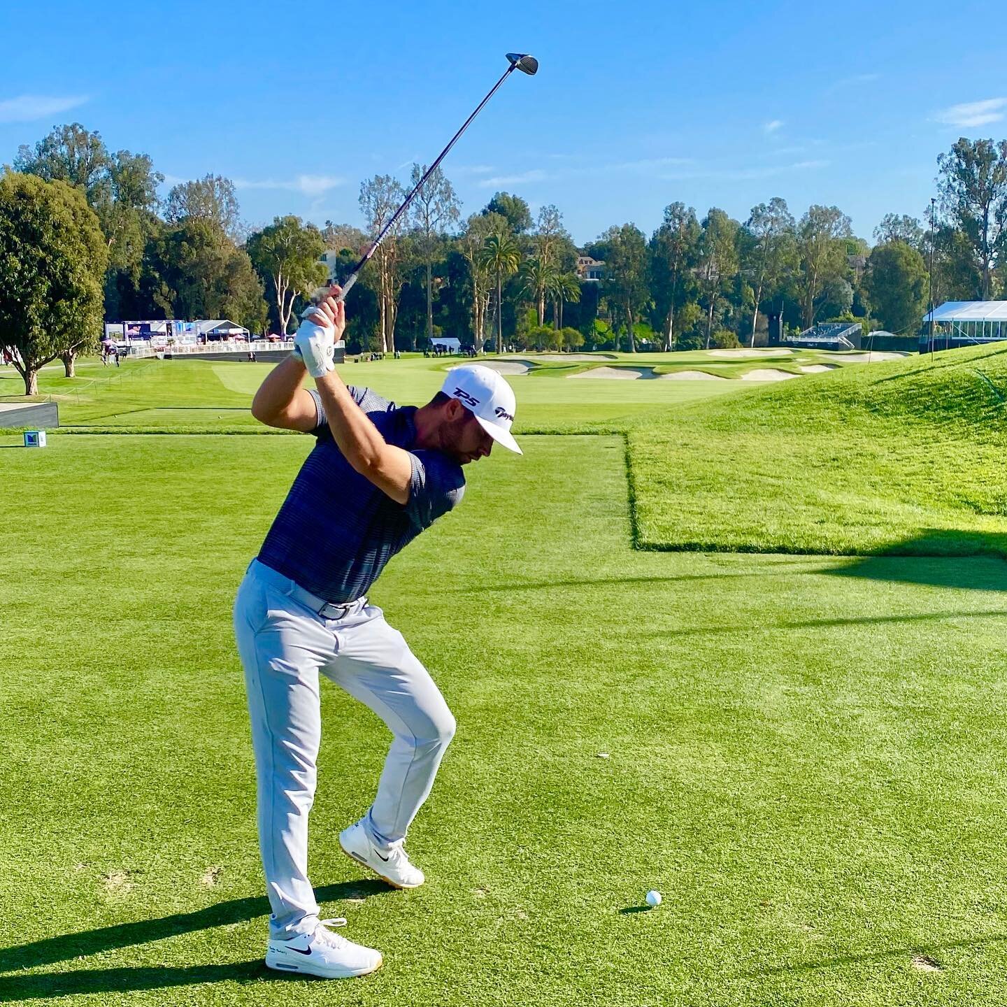
Finally, the banner has evolved into a minimalist approach with nods to the past, still featuring the first at Rustic Canyon. It's also designed to be friendly to all devices.
In the meantime, please sign in and sign up and let me know what you think. Thank you for your support and your patience during the inevitable bumps in the road to a modernized site!
Banner circa 2013
Banner circa 2017


